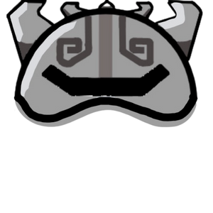
U guys should go tank up but okay…
4 Likes
i like it, but i feel like r it a bit too big, like ingame, it would cover almost half of the skin
2 Likes
It is to big, yes let me fix that did notice that.
2 Likes
Credit to Slapadabass for the shadowing!

5 Likes
u didnt rlly change the size. still like half the player size. idk
5 Likes
I did, i made it smaller
1 Like
many of the skins will lose most of the detail tho. like, it still covers up half of the skin u r using
4 Likes
wholly crap i love tht
3 Likes
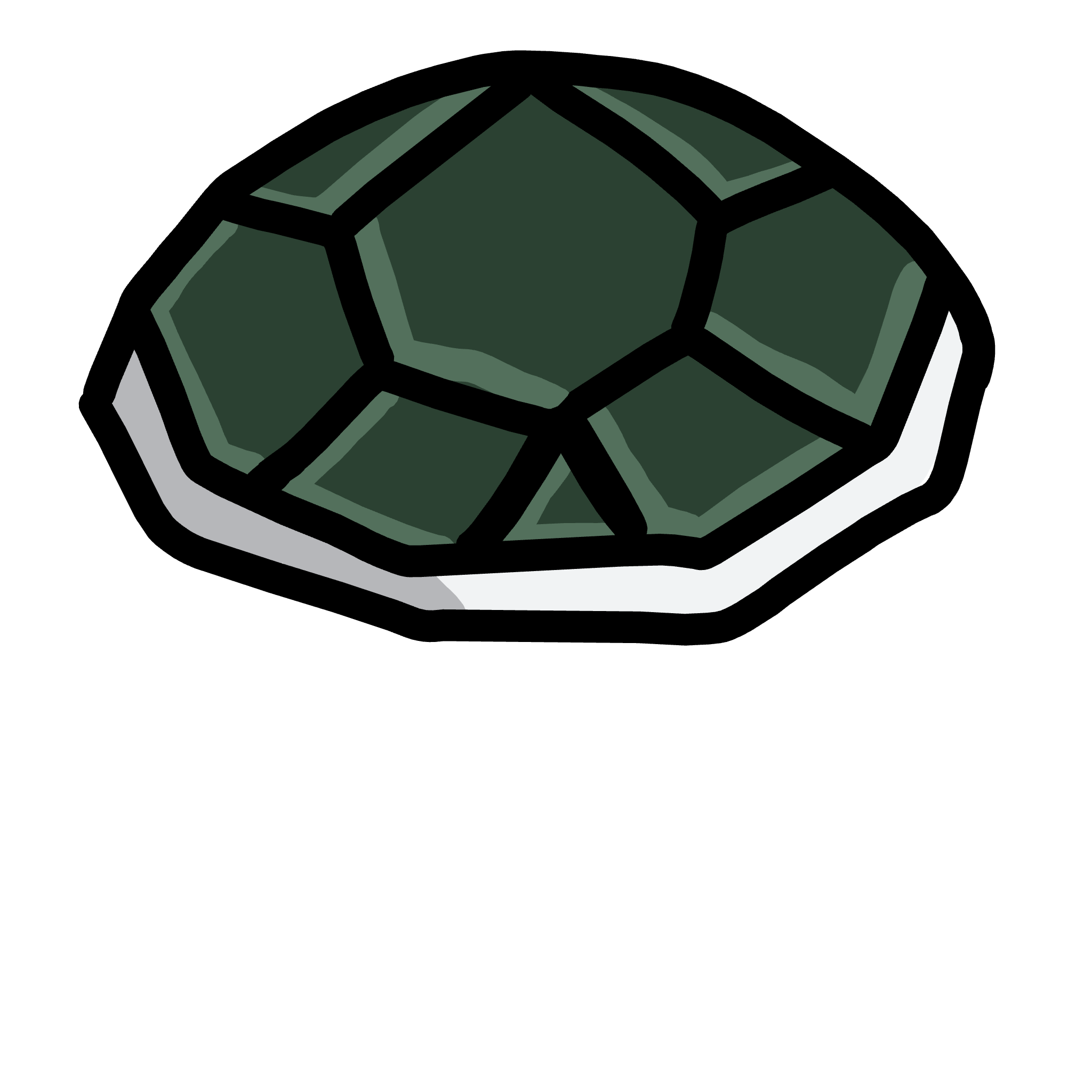
yo its cool but the green could be a bit lighter
2 Likes
i actually rlly like it dark like tht
3 Likes
Maybe some are lighter and others are darker
2 Likes
- Light
- Dark
- mix
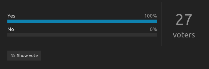
0
voters
1 Like
Yea but iam just saying what i think could be better, but its just an opinion
3 Likes
Can there be a mix option?
4 Likes
Sure
4 Likes
Tried to size sketch’s thing down… Don’t think I did much lol
4 Likes
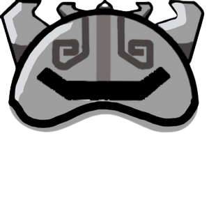
Thanks
3 Likes
Finished the rook one, I’ll post it later
5 Likes